AI Ready — Or Just Using AI?
Take the AI Readiness Assessment →


It’s something you interact with every time you use Accelo, whether it’s checking on your deadlines, viewing a timesheet, quickly creating a new task or issue, or viewing all companies. Or if it’s a really tricky day, getting help! The left hand side menu and top navigation is the supporting artist to your headline act. So finding your way around should be easy.
Users have been asking for improved and simplified UI/UX. And implementing best practice and accessible design and providing consistent, best in class UI/UX is a high priority for Accelo. So we're excited to introduce some improvements to the navigation look and feel.
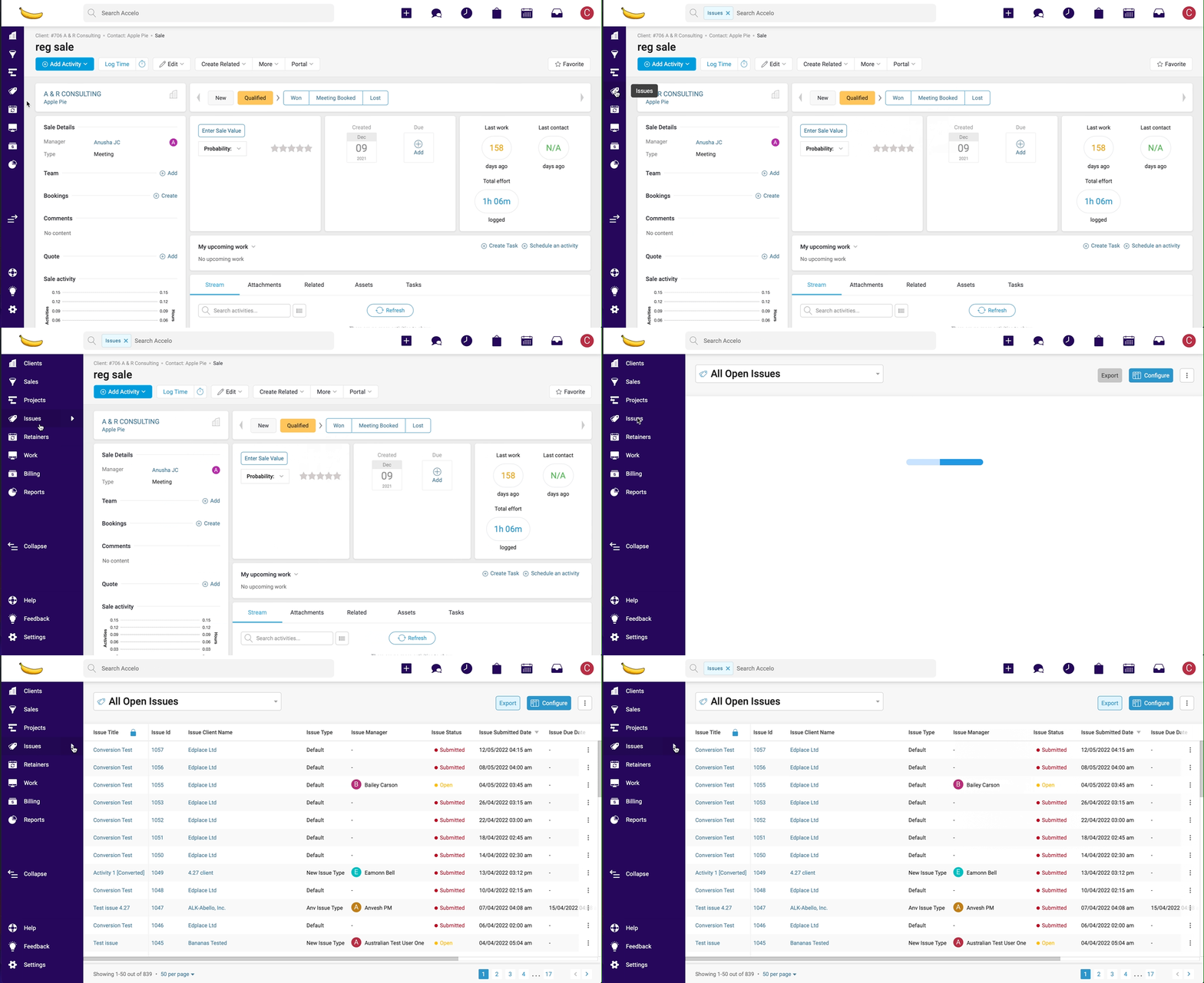
Changes to the left hand side and top navigation are part of our long-term project to improve user experience in Accelo. As an initial step, the latest navigation update will bring a modern, cohesive design while retaining familiar functionality and brings back the crowd favourite – 1-click to list all.
The left hand side menu in expanded state now has 1-click to list all for companies, contacts, projects, tickets, sales – back by popular demand!
Note: In collapsed state, 1-click from the left hand side menu will continue to open the Module pop-out menu.

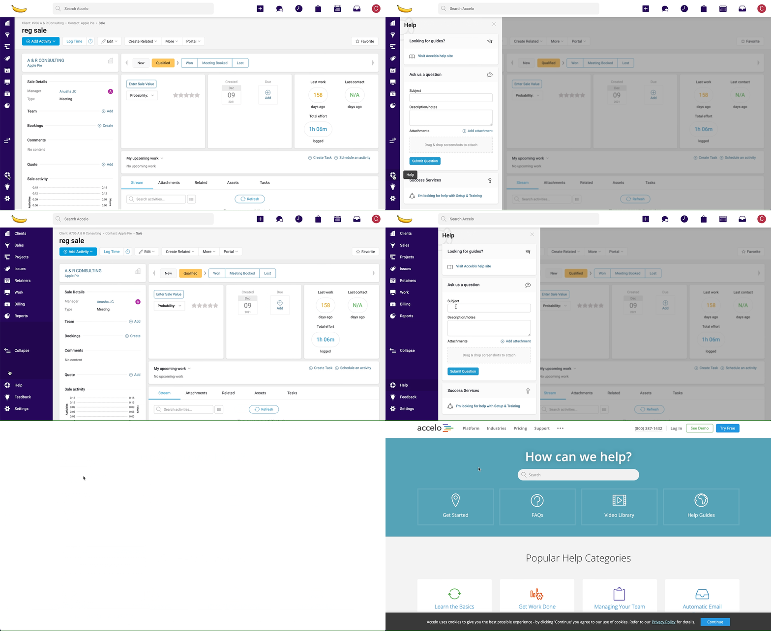
Help now has a permanent easy-to-find home on the left hand side menu. Clicking on Help will open a context panel with a clean new look that contains all the same content and familiar icons so you can easily find the help you need.

Note: ‘Looking for Guides?’ links you to our Help & Support page where you’ll find Tutorials and Tips and Live Chat.
For users with Live Chat enabled, you’ll notice that Live Chat has also made the move to the left hand side menu, with a fresh new icon to create a clearer distinction between Live Chat and Stream. Rest assured, Live Chat functionality remains unchanged.
Note: Live Chat is only available for users with a subscription including Accelorated Support – Find out more about how to take advantage of this super service!
We’ve restyled menus to include icons to add visual cues for content and consistent vertical lists to improve navigation so you don’t have to think twice about how to get where you’re going.

You'll notice the Add menu has a new name – Create. Plus the menu has been reorganised to prioritise quick actions and transactions at the top and align with the left hand side menu to reduce cognitive load and improve navigation for new and existing users.
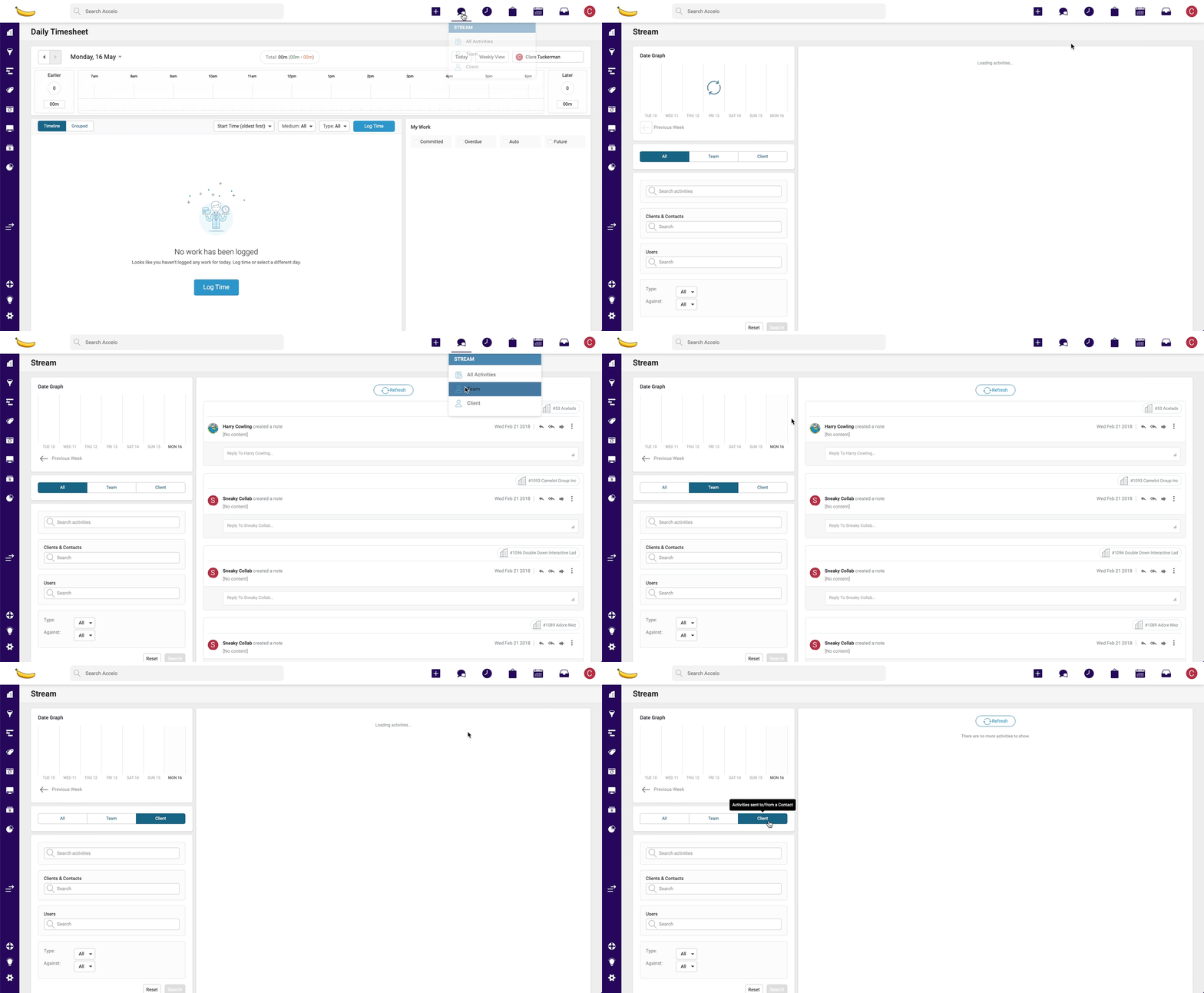
Users with Stream enabled will notice a new Stream menu with links to Stream filters – All, Team, Company which will allow users to click through to the filtered Stream page. This will be a handy shortcut for users who don’t have Stream set up as their default Home Screen.

Note - Stream menu will only display when users have enabled Stream
No. You’ll need to make the switch to Custom Lists to take advantage of 1-click.
The magic only happens when the left hand side menu is in expanded state. If the menu is collapsed, you’ll notice the Module pop-out menu opens – you can still find all-lists in the top right corner[image class="ss-htmleditorfield-file image"].
When you hover over buttons, icons and menu items on the left hand side menu or top navigation you’ll now notice a slight darkening of the background colour instead of the previous contrast.
We have exciting plans for continued modernisation and improvement the look and feel in Accelo. Find out more about our vision and how you can stay up-to-date.
We're so glad you asked! If you would like to provide feedback, we encourage you to add your suggestions to the Ideas Forum.

