A burn down chart is a visual representation showing remaining work against time. Burn down charts help teams monitor progress and determine whether a project or sprint is on track to finish by its planned deadline. Burn-down charts are most commonly used in Agile project management to monitor sprint progress and identify schedule risks early.
Why Are Burn Down Charts Important?
Burn down charts offer several benefits to project teams:
- Clear Progress Tracking: Burn down charts provide a quick snapshot of how much work is left, making it easy to assess whether the project is on track.
- Early Warning System: If the remaining work doesn’t trend downward as expected, teams can identify potential bottlenecks early.
- Improved Team Accountability: With clear visuals, burn-down charts promote accountability as each team member can see collective progress.
- Enhanced Motivation: Seeing progress visually can motivate teams to stay focused and on schedule.
By helping teams understand their progress and any roadblocks, burn down charts contribute to smoother project workflows and timely project completion.
What Are the Different Types of Burn-Down Charts?
There are several types of burn-down charts, each suited for different aspects of project management:
- Sprint Burn-Down Chart: Tracks progress within a single sprint or iteration, commonly used in Scrum.
- Product Burn-Down Chart: Shows progress for an entire project or product backlog, useful for long-term project tracking.
- Release Burn-Down Chart: Focuses on the work remaining until the next product release.
- Scope Burn-Down Chart: Monitors changes in project scope, reflecting any added or removed work that may impact the timeline.
These variations allow teams to customize their approach based on the specific needs of their project or development cycle.
How Does a Burn Down Chart Work?
A burn down chart compares the amount of work remaining against the time left to complete it. Time is plotted along the horizontal axis, while the vertical axis shows the remaining work, typically measured in tasks, hours, or story points. As work is completed, the remaining work should steadily decline toward zero by the project's planned end date.
Most burn down charts include two lines:
- The ideal burn line, which shows the pace required to finish on schedule.
- The actual burn line, which reflects the team's real progress over time.
Comparing these lines helps teams quickly identify whether work is progressing as planned or if delays, bottlenecks, or scope changes are putting the project at risk. While burn down charts are most commonly associated with Agile software development, the same principle can be applied to many professional services projects where remaining work can be measured against a fixed timeline.
How to Create a Burn Down Chart
To create a burn-down chart, project teams follow these steps:
- Define the Total Work: Determine the scope of work at the beginning of the project, typically in tasks, hours, or story points.
- Set the Time Frame: Establish the duration of the project, sprint, or release period.
- Track Daily Progress: Update the chart regularly to show how much work remains each day or week.
- Analyze the Trend Line: A steady downward trend suggests the project is on track, while a flat or upward trend may indicate delays or added work.
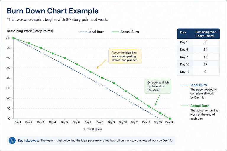
The goal of a burn-down chart is to help teams achieve a downward slope, reaching zero remaining work by the end of the project. If the actual progress line stays close to the ideal burn line, the team is on pace to complete the sprint on time. If it begins to flatten or rise above the ideal line, it's an early indication that the project may require additional resources, scope adjustments, or other corrective action.
What Tools Are Used to Create Burn-Down Charts?
There are many tools available to create burn-down charts, ranging from simple spreadsheets to advanced project management software:
- Spreadsheets (Excel or Google Sheets): Basic charts can be set up in Excel or Google Sheets, ideal for simple projects or small teams.
- Project Management Software: Tools like Jira, Trello, and Accelo, now with Forecast, have built-in burn-down chart features.
- Scrum Tools: Specialized agile tools, such as Scrumwise or Monday.com, provide detailed burn-down chart options for Scrum and agile frameworks.
- Custom Graphing Tools: For highly specific needs, teams can use Python, R, or other programming languages to build custom burn-down charts.
The choice of tool depends on the project’s complexity and the team’s preferred workflow.
How is a Burn-Down Chart Different From a Burn-Up Chart?
Burn-down and burn-up charts are similar but track progress in opposite ways.
- A burn-down chart focuses on work remaining, displaying a downward trend as work is completed.
- A burn-up chart shows work completed over time, with an upward trend moving toward the total project scope.
Burn-down charts are better for tracking how much work is left, while burn-up charts provide insight into work completed versus total scope, especially useful when scope changes frequently.
When Should You Use a Burn Down Chart?
Burn down charts are most useful when teams need a simple way to monitor delivery progress over a defined period of time. They're commonly used during Agile sprints, but the same approach can be applied to consulting engagements, client implementations, IT services projects, and other professional services work with a fixed scope and deadline.
Project managers often use burn down charts to:
- Monitor sprint or project progress
- Identify schedule risks before deadlines are missed
- Support daily stand-ups and project reviews
- Communicate project status to stakeholders
- Compare planned progress with actual delivery
While burn down charts provide valuable visibility into project progress, they work best alongside other operational metrics, such as resource utilization, capacity planning, project profitability, and forecasted completion dates.
What Are Some Common Challenges With Burn-Down Charts?
Burn-down charts are powerful, but they come with challenges:
- Inaccurate Estimates: If initial task estimates are inaccurate, the chart’s progress line may not reflect true project status.
- Scope Creep: If new tasks are added during the project, the chart may show an incorrect view of progress.
- Infrequent Updates: Failing to update the chart regularly can lead to outdated or misleading information.
- Misinterpretation: Burn-down charts are simple but can be misinterpreted, especially by those unfamiliar with agile principles.
To overcome these challenges, teams should keep estimates realistic, update the chart consistently, and educate stakeholders on how to read and interpret the data.
What Are Best Practices for Using Burn-Down Charts?
For effective burn-down chart usage, consider the following best practices:
- Update Daily: Regular updates keep the chart accurate and reflect the current project status.
- Maintain Realistic Estimates: Set achievable goals and realistic task durations to avoid misleading data.
- Involve the Team: Regularly review the chart with the team to encourage accountability and collaboration.
- Monitor Trends, Not Daily Changes: Focus on the overall trend rather than daily fluctuations to avoid overreacting to minor setbacks.
These practices help teams get the most out of burn-down charts and keep projects on track. Additionally, many professional services organizations use burn down charts alongside PSA software that provides real-time visibility into project health, resource allocation, financial performance, and delivery risk.
How Often Should a Burn-Down Chart be Reviewed?
The frequency of reviewing a burn-down chart depends on the project. For short sprints, daily reviews are typical to keep the team aligned. For longer projects, weekly reviews may be enough, though more frequent updates help maintain accuracy. Reviewing the burn-down chart regularly ensures everyone stays on track, especially in agile workflows where the team needs to adjust to changes quickly.
How Accelo Helps Teams Stay Ahead of Project Risk
Burn down charts provide a useful snapshot of project progress, but they represent just one view of project performance.
Accelo gives professional services teams a more complete picture by combining project management, resource planning, financial management, and AI-powered forecasting in a single platform. Teams can compare planned versus actual progress, identify delivery and budget risks early, and make informed decisions before small issues become missed deadlines or reduced profitability.
Next Steps
Looking for more than a burn down chart? Explore Accelo's PSA platform to see how connected project planning, resource management, and predictive insights help professional services teams deliver projects on time and protect profitability. Book time with our team now.

.svg)